
Bad Religion: Against the Grain
1990
Epitaph Records
Format I own it on: Compact Disc
Track Listing: 1. Modern Man 2.Turn on the Light 3. Get Off 4. Blenderhead 5. The Positive Aspect of Negative Thinking 6. Anesthesia 7. Flat Earth Society 8. Faith Alone 9. Entropy 10. Against the Grain 11. Operation Rescue 12. God Song 13. 21st Century (Digital Boy 14. Misery and Famine 15. Unacceptable 16. Quality or Quantity 17. Walk Away
This is possibly one of my favorite Bad Religion albums. Released in 1990 (again, a year after their previous album), the band sounds like they're fed up with the state of the world and are going to do everything in their power to drill it into our thick skulls once and for all...
The title track is a towering moment in the band's catalog...a racing punk backdrop set against a Thin Lizzy-ish dual guitar lead and a defiant vocal melody...it feels like updated protest-folk..."I maintain against the grain..."
Some people point to this album as the moment Bad Religion starts to "go soft." It's true that there's more "Hard Rock" material on here, but the songs with the slower tempo are such undeniable winners that I can't understand how they can be a problem..."21st Century Digital Boy" is so confident and different than anything they've even attempted to this point. I know the song's impact has been lessened somewhat by its return on "Stranger Than Fiction" but I'm telling you...Think back before "Stranger Than Fiction," before it was overplayed on the radio...you know this song came on and it rocked your shit...
But outside of a small handful of more measured moments, the remainder of the album is as fast (if not faster) than ever...I mean, does "Modern Man" sound like a band going soft to you? And "Entropy" is one of the most philosophically blunt songs ever recorded...
Come to think of it their lyrics are getting extra thesaurus-y. starting here...Check out this line from "the Positive Aspects of Negative Thinking:"
"Syntactic is our elegance, incisive our disease,
the swath endogenous of ourselves will be our quandry..."
Alright, this calls for a quick game of "Spot the Made-Up Word: Bad Religion Edition." Three of the below words are actual words used on the "Against the Grain" album, the fourth word is a word I just made up, See if you can spot the fake word...
Here we go:
a. Rectilinear: Moving in, consisting of, bounded by, or characterized by a straight line or lines.
b. Discomfiture: Lack of ease
c. Obscilliance: To move away from the mid-line of the body.
d. Anthropocentric: Interpreting reality exclusively in terms of human values and experience.
If you chose C as the made up word you are correct! Move ahead 2 spaces...
I kinda feel it's too bad that my favorite Bad Religion album doesn't even have their coolest cover...I mean, I guess the picture of the ear of corn fits the title, but it's just not kick-ass enough...I mean, an ear of corn? How can an ear of corn be kick-ass? I mean look at corn...

Does that look kick-ass to you?
Come to think of it, despite how much I enjoy their albums I don't generally get too excited about their artwork...It' s kind of hit or miss, compared to the consistent high quality of their music...You know, I kinda feel like wasting time today...Here's my list of favorite to least favorite Bad Religion album covers...Did I give this list a ton of thought? I don't know, I have a hard time converting 5 minutes into a proper measurement of weight, but here they are...
#1: Self-Titled

I think I may have talked about this a couple posts ago but this simplistic, yet striking design makes it an easy favorite....
#2. How Could Hell be Any Worse?

Oddly enough, I just realized these might go in chronological order for a bit...The Plain red reminds me of the low-budget hardcore aesthetic that I love so much...
#3. Suffer

The Burning Boy is just a punk icon at this point...
#4. The Empire Strikes First

The black, white and red color scheme is striking against the grainy xerox-quality photo...it looks urgent...I like it...
#5: Stranger Than Fiction

Again, simplicity makes this one work...a nice black & white photo...I believe I used to have a t-shirt of this cover back in the 90's...
#6: Back to the Known
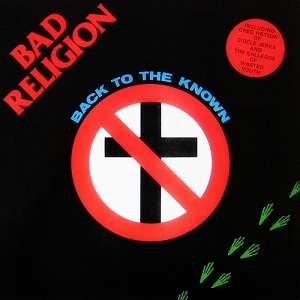
In my heart of hearts, this is probably my favorite, but I have to acknowledge the fact that it's a re-tread of the first e.p cover...just with Frogger footprints added...but those Frogger footprints mean a lot to me, dammit! Oh well...
#7: Into the Unknown

This looks like an awesome Trapper-Keeper!
#8: No Substance:

The pixelized image reminds me of an Adam Ant cover...Plus it has that girl from "Third Rock from teh Sun" on the cover...I think it looks pretty cool...I'll give it number 8....
#9: All Ages

Nothing earth-shaking...just the B.R font against some old flyers... I think everyone's aware of my love of old flyers...
#10: No Control

Doesn't do a whole lot for me...that color scheme brings back nightmares of the late 80's early 90's...I think with a more appealing color scheme this could be one of my favorites though...
#11: Tested

This one's kind of cool, I like the idea of a postage stamp...I wouldn't recommend licking this though...
#12: Recipe for Hate

Why do I have this so low? It's got dogs wearing suits! Again, I didn't really give this list too much thought... I think I'm rating it this so low because of the color scheme doesn't do it for me... I think if you took the "Empire Strikes First" approach to this image it could be really awesome...
#13: Against the Grain:

I don't know it seems kind of...Corn-y.. (rimshot)
# 14: True North

It's not very eye-catching but I like the thought behind it...
15: New Maps of Hell

Looks kind of like a T-Shirt that a tattoo company or something would put out...
#16: the Gray Race

I guess conceptually this holds up...I mean, with a title like "the Gray Race" it shouldn't have the most exciting cover but...
#17: 80-85

This is an example of minimalism not working...The photo itself is very cool, and often duplicated but I think it'd look a little cooler if the border was maybe another color...Maybe a black border with a white font for the text...the white border doesn't do the photo justice...
#18: Generator

It's really 1991-looking to me... sort of nondescript...I feel such an amazing album deserves a cooler cover...
#19: the Process of Belief

dull. Again killer album, but the cover doesn't do anything for me...
#20: the Dissent of Man

It should be an exciting 3-D blockbuster, but instead it's kind of boring...Kind of like "Titanic 3D"...Now if you put the dog heads from "Recipe for Hate" in 3-D, then you'd have something!
21: New America

I don't know why I don't care for this...Good concept but it seems like it should look cooler than it does...the red around the logo looks too cluttered but if it wasn't there it wouldn't stand out against the helicopters...Maybe they could have put some sort of border around it and placed the logo on that, but I'm not so sure there's enough room on a tiny CD cover for that...
#22: Punk Rock Songs

The others are all the Mona Lisa compared to this one...My Lord, that's an ugly ass cover...
Well, I think I've wasted enough of your time today, let's listen to "Against the Grain" by Bad Religion...Enjoy...
No comments:
Post a Comment